Kirk Wallace, also known as Bone Haus, is a freelance illustrator, animator, art director, and much more who has created designs, animations, campaigns, and much more for clients such as Adobe, Apple, Disney/Pixar, McDonalds, Rocket League, Uber, and many more. He’s known for his bold, hyper-stylized, detailed, yet simple style. Follow Bone Haus on Instagram, YouTube, or take one of his classes on Skillshare.
He presented at Wacom’s Creativity Camp 2024 — watch a recording of that workshop here — and we interviewed him about his work and career — read that interview here.
In the below video, he shows off a recent set of illustrations made on his Wacom Cintiq Pro 27. In the blog post below, he explains the inspiration and process behind it.
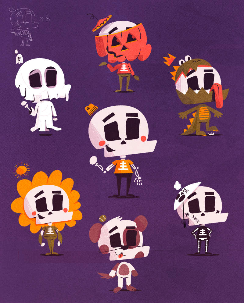
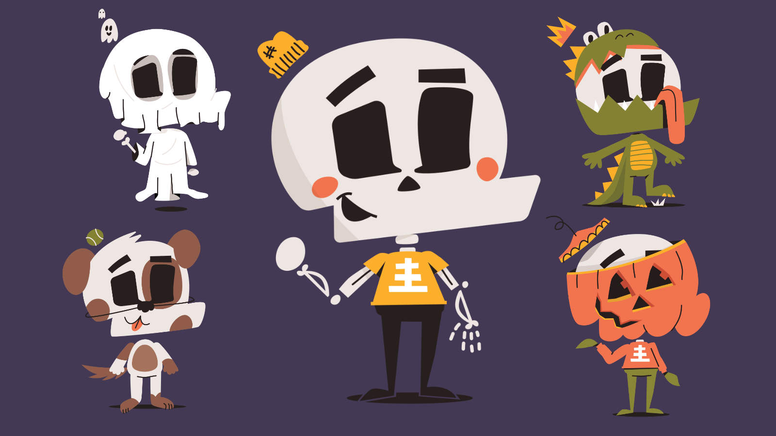
The Many Faces of Skully!
Growing up, I always loved toys and action figures that had masks, helmets, and modular accessories. Customizing a character with a homemade cape or trying to make a helmet out of clay that the character could put on and take off was my goal. I’ll never forget seeing the LEGO characters with helmets that had visors, which could slide up and down over their eyes. That year, I filled my Christmas list with those items — and the next, and the next.
With this piece, I wanted to tap into that same fun of sliding shapes around to disguise Skully in different outfits while keeping his base shape and form the same. So, I decided to give him a whole bunch of funny Halloween costumes, focusing mostly on his big head shape.
This whole piece is being made on my new Wacom Cintiq Pro, which I can’t say enough good things about. I had a 24 QHD before and wasn’t sure if the upgrade was necessary, but after receiving it, this feels like SUCH a premium experience. It makes drawing fun and has me excited to get to my desk each day.
I started with the simplest sketch I could of Skully, focusing on flowing proportions — a giant head, smaller chest, and long legs. I sketched this all out in Photoshop roughly and, as always, did 2-3 versions on top of each other until I was happy.
Once I was satisfied with the ‘base’ character, I made a bunch of copies at 20% opacity and started doodling costume ideas on a new layer above. Constraining each costume to fit the shapes below which made for some fun solutions. I mimicked his hat in each costume, sometimes with a little floating ghost instead of his hat, and sometimes a little sun.
I always love working with simple constraints to force some creativity.
I did a quick coloring in Photoshop to get a general idea of how I wanted them to relate to one another, then traced it all in Adobe Illustrator with the pen tool to refine the shapes. Afterward, I added some details with strokes and a few shadows here and there.
When it comes to details, I like drawing lots of little shadows where I see shapes overlapping. Because I don’t normally use much outline or heavy shading, I rely on these shadow shapes to give some depth and richness.
Finally, I take these flat shapes from illustrator and bring them back into photoshop for a few effects and texturing. I’ll use a combination of clipping masks, layer masks, adjustment layers, some brushes, and scanned textures to give the piece a warm hand made feel. Most of my brushes just come from Creative Cloud that are included with a subscription, and most of my textures are scanned in myself, just smearing ink around on a piece of paper.

What I like most about this piece is that it feels… ‘engineered,’ in a way. It feels like this could be a character in a game where you can pop on different helmets, shirts, shoes, etc., and have them run around in a world. Here’s to making a little game some day with the world of Skully!


