When it comes to creating artwork, we don’t necessarily follow the trends, but it is undeniable that changing aesthetics may affect our taste and perspective especially when our style or technique is open to having innovations.
In this article, I will present some current illustration trends that I found for you. These are some specialties that I observe are present in many artists’ work, which add a certain quality to the images that are created by them. I should also mention that these are very subjective, and some illustrations that I use as an example in this article have multiple of these points at the same time.
It is important to mention in the beginning that, in 2024 we will be seeing more maximalism and diverse character design in illustration, than the last years. In both commercial use and personal works, these two elements are the two leaders of the trends to watch out for. So when you’re reading this article, remember that many of these examples also carry traces from these two design elements.
Without further ado, I’d like to introduce you to the first trend of my selections:
Symmetrical Composition
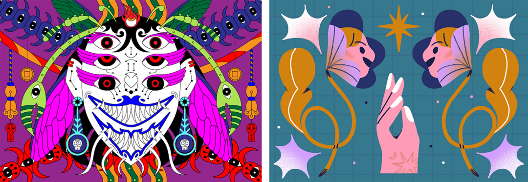
Who doesn’t like good symmetry? While adding a geometrical language to your designs, symmetry can also be used to create more maximalist images.

Using bold and muted colors together, and creating colorful palettes, symmetrical composition will add a good quality to your artwork.
You made a good design but it looks a bit empty? Try multiplying it and using its symmetrical twin in the same frame. You can also multiply it and rotate the copies and reverse the colors for a richness.
Don’t forget to add little geometric shapes or floral/ quirky decorations around, and voi-la! You have an illustration with a full and neat composition to look at.
Abstract Perspective
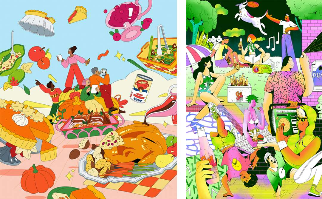
Perspective is not always so easy to nail while staying in your own style. But once you get the hang of it, It is always fun to extend the boundaries of your imagination and play with realistically impossible possibilities.
You probably have also noticed that, in recent years, a distorted perspectival game changer was introduced to the illustration scene with the use of really large feet and legs. Ok, maybe it wasn’t really introduced in the recent years, but it has surely been really popular among many illustrators. Suddenly our Instagram feeds were filled with proportionately larger human body parts, and I don’t know about you but I lived for it!
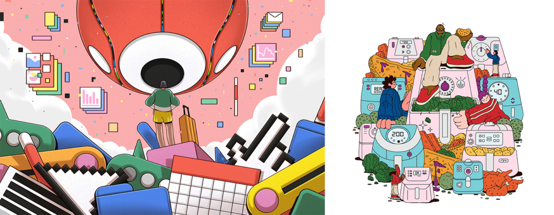
In 2024, things are changing even more.
If you’re looking to try something new in your artwork, think about distorting not only the size and perspective of the body parts, but also of the objects and decorative elements that you are using in your illustrations. An object which seems to be far away can be larger than the object in the front, and vice versa. Try drawing floating objects, or eliminating perspective all together. What can you create when you delete the rules of reality? Or maybe the right question should be; what can’t you?
Limited Palette (vibrant and muted colors together)

The colors we use when drawing an illustration is usually what makes or breaks it. Yes, I already mentioned maximalism, which basically means “more is more”, but sometimes it’s possible to say “less is more” color-wise, and still maintain a maximalist look. In my opinion, this creates an elevated look on illustrations and makes them really nice to look at.
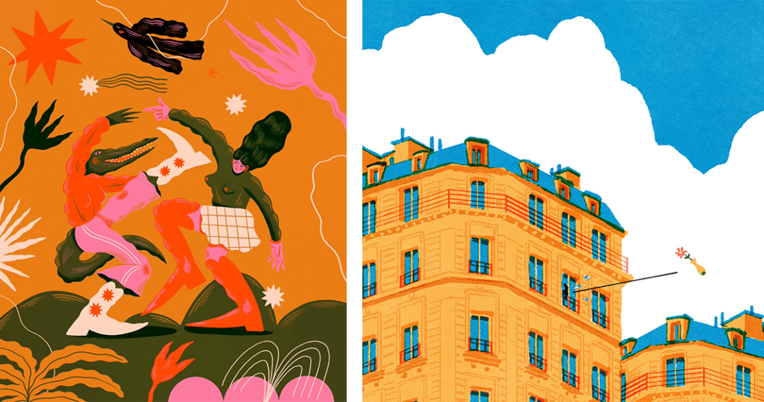
As you can see in these examples, you can challenge yourself by limiting your palette up to 5 or 6 colors (preferably even less than that) and try painting your illustration that way. Use colors that you wouldn’t normally think of using for skins or other objects, and try to avoid using the same color for elements that are next to each other. Why not have green, blue or purple skins and a yellow sky? Just get creative and see where it takes your artwork!
3D / 3D Looking Elements

3D illustrations have definitely been on the rise as of lately. As the softwares and technical tools are getting more accessible and user friendly, more and more illustrators are creating their own 3D designs with their already existing style.

3D design has been a dominant theme in personal portfolios of many digital artists but we also see it in music videos, corporate identities or commercial usage of other kinds. It is not only pleasant to look at, but also it is fun to create something of your own that exists in a virtual space!
Moreover, with the rise of online lectures that you can find on many platforms such as SkillShare, it is now easier to learn 3D design. Interested in learning more about 3D design? Check out this article I wrote about 3D design courses you can find on SkillShare.
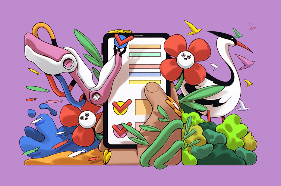
But there is a second way to use 3D elements as part of your design. You can just use your painting and shading skills to create 3D-looking elements in your drawings.
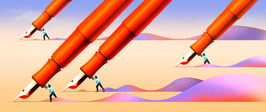
In 2024, we will be seeing more of these examples, as the trend is gaining acceleration. These examples I’m showing here are not all in the same style of aesthetics if you ask me, but from the point of 3D usage, they can be considered in similar categories.
If you want to turn some elements in your illustrations into 3D-look, I would suggest using airbrush type brushes and practicing your light and shading skills for it. You got this!
Texture
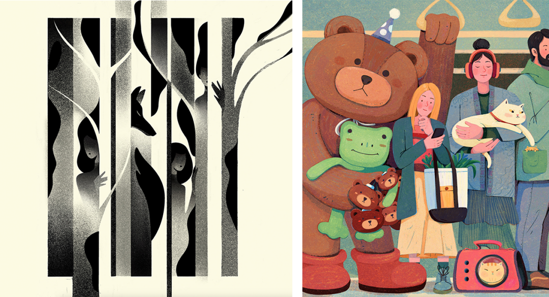
If you’re an illustrator, you know that small changes make big differences! Especially when it comes to adding fun details on our illustrations such as textures.
Textured brushes give illustrations a more hand-painted/ traditional artwork look, and on digital drawing it can be a game changer even when you make very subtle touches.
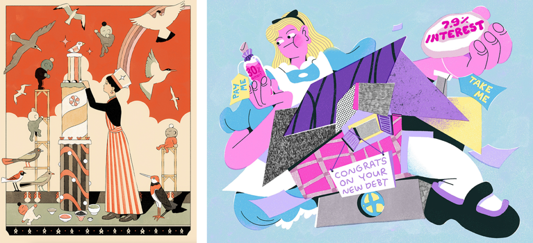
If you want to get good at using textures, you can try by using a textured liner brush for your outlines. Then you can maybe add just some slight textures on your backgrounds or on some parts of your characters’ clothes.
Remember that you wouldn’t wanna make the textures overpower the whole illustration, so try playing with the transparency and the modes of your texture layer. But in the end, if you want to make your drawings all about textures, why not? It is your artwork, you can do whatever you want!
Negative Space
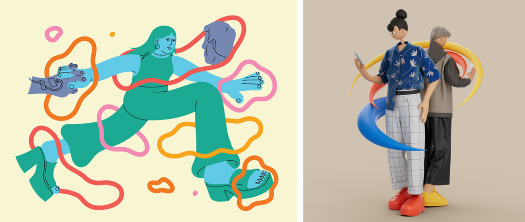
When I was a small child and drawing just for fun, I used to have this pressure of “not leaving any empty space” in my drawings, because that’s what the art teachers in school used to say. That always had a mood-killer effect on me, and I didn’t enjoy filling out a paper just because I had to.
Now that I draw as a way to make a living, I’m understanding that the use of negative space also has a value in art. The trick is knowing how to use it and understanding the balance and proportions of your composition.
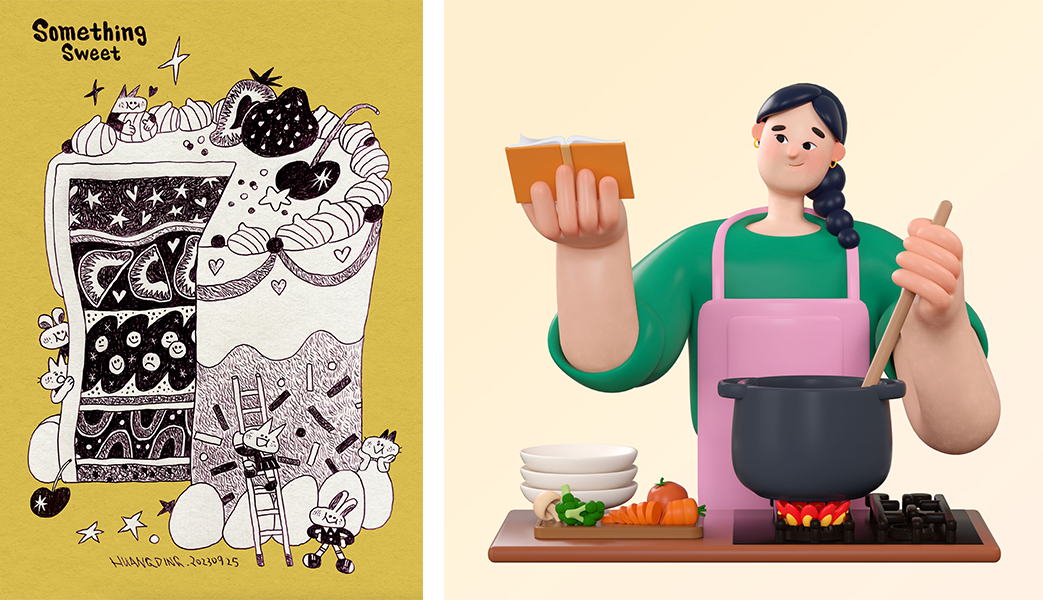
As you can see in these images, even though they have different styles, they are still examples of good use of negative space. In 2024, you may want to master your skills of negative space usage, because it is getting widely common in commercial use.
You can not only design posters or editorial pieces this way, but you can also turn your drawings into stickers. Moreover, the more you master this skill, the more you can learn to combine it with maximalism and find balance in your illustrations.
According to the Oxford Dictionary, a trend is “a general direction in which something is developing or changing.” So these trends I’ve talked about in this article are not rules set in stone, but just some opportunities to elevate your artwork, if you’re looking for some inspiration.
And if you are now feeling inspired and looking for some digital tools to create more artwork, why not check our pen tablets and pen displays that make life easier for illustrators? Wacom offers many options with the best pen technology, so the only thing left for you is to practice and start creating.
Looks like 2024 is going to be yet another good year for illustration!
About the author:
Zeynep Alpay is a freelance multidisciplinary artist and illustrator based in Köln, Germany. Their work encompasses illustrations, animations, paper cut-outs, and traditional artwork.
For more information or to see more of Zeynep’s works, check out their portfolio, their Instagram, or their Linkedin.

