How to Make Digital Paintings Look Traditional
By Viv Le
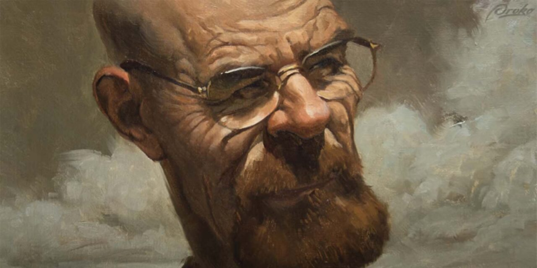
Digital painting is incredibly versatile. You can create anything and work in any style, but what if you want your digital paintings to look like traditional artworks? In this video, Court Jones from Proko shares seven techniques and habits he uses to make his digital paintings resemble oil paintings on canvas.
Watch the video here.
Follow a Traditional Process
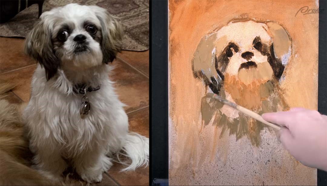
Apply the same steps in digital painting that you would when working with real paints on a canvas. For instance, when working with oil paints, I begin by staining the entire canvas with a neutral or warm hue. Then, I do a quick gesture line drawing before adding washes of local colour to block in large shapes or set a contrast for the colours I’ll use later. Creating similar layers of undertone in a digital painting gives the illusion of more texture and colour vibration.
Textures
One way to make a digital painting look as if it was made with traditional materials is by incorporating visible textures, like canvas weave or paper grain. This is easily achievable in software like Photoshop. However, it’s a good idea to learn how to create and customise your own brushes to have greater control over the look of your work. For a quick tutorial on creating a streaky textured brush, check out the video.
A word of caution: If you use the same texture on every brushstroke, it can become monotonous. So, experiment with different brushes and textures within the same artwork.
Limit Your Layers
Where possible, paint on just one layer or as few layers as you can. On a real canvas, you only have one physical layer to work on. Having many layers in a digital painting can serve as a safety net, but it may prevent some artists from being more daring and expressive with their brushwork. By sticking to one layer, you’ll approach problem-solving more like a traditional painter, and your paintings will appear more like traditional mediums.
Avoid Special Effects
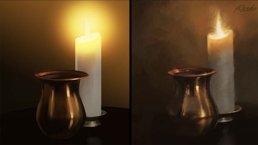
Digital painting offers many special effects, but they can sometimes look overly artificial. In my painting, I avoid using selections, fills, gradients, and multiple layers. Instead, I rely on expressive brushwork and thoughtful colour choices to solve problems. Also, resist the urge to use the “Undo” command when you make a mistake—just paint over it as a traditional painter would.
Use a Controlled Colour Palette
When observing your subject or reference photo, decide on the light’s colour temperature. Then, pre-select a limited range of colours and arrange them on your palette before starting. Prepare all the major halftones, transitions, and shadow colours in advance.
In digital work, you can place these dabs of colour on your canvas, keeping them off to the side and using the eyedropper tool to pick colours as you paint. While you can adjust the brightness or darkness of these palette colours, avoid introducing new colours as you go. Most importantly, don’t sample directly from the reference photo. Engaging your brain in this process will improve your ability to choose colours intuitively over time.

Stay Zoomed Out
The further away you are from your painting while working, the more painterly and impressionistic and painterly your work will be. When painting digitally, stay zoomed out on your work as much as possible. Try to keep the whole painting in view while working on it. If you zoom in on small areas too much, it will tempt you to overwork the details, increasing the chances that you’ll sacrifice the unity of the composition.
Forget the lines — it’s all about edges!
Edge variation is one of the most overlooked and underused techniques in digital painting. And it’s probably the single most important trait of an artist’s style, other than color, which distinguishes you from other artists. You’ll get a variety of edges by painting back and forth over the line drawing, pushing, pulling and smudging the digital paint. Real oil and acrylic paints mix on the surface, colors overlap and cross contaminate with each other. The more variety you add to your edges in your digital work, the more painterly your work can look.
To soften and blend edges, look for brushes that have broken or streaky footprints and then use a light touch. Use smudging tools sparingly. And don’t forget, for visual contrast, there should be plenty of hard crisp edges in a painting as well if you want a realistic look. As a general rule, a good place to soften or even lose an edge entirely is when the values of two adjacent shapes are really similar.
Conclusion
So, you may have noticed a pattern. The recurring theme here is to try to mimic the procedures of traditional artists, and to limit your digital tools so that they reflect more accurately the limitations of traditional materials. If you do that, your digital work will be more a reflection of you and your skills, rather than the software.
About Court Jones
Court Jones is a freelance commercial illustrator and caricature artist based in San Diego, California. He has done extensive illustration and concept work for film and television, as well as editorial and product illustrations for clients such as Atlantic Records, Rolling Stone Magazine, Wired Magazine, The Washington Post, and Blizzard Entertainment.

About Proko
Proko is an online resource for artists where they’ll get fantastic art instruction videos that are both entertaining and educational. Proko’s core message is to make learning fun. If you’re having fun and enjoying the learning process, you’ll learn better because you’re paying attention, will retain more information, are more likely to continue learning and much more likely to go back and re-watch the tutorials. You’ll also leave more inspired and highly motivated to go practice. Check out their YouTube for free tutorials, or their website for all of their offerings.


